Business Flyer
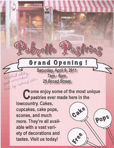
Ever since I was a child I have always wanted to own my own bakery. I am very artsy and love using food as my medium. I love the cutesy feel of a small local bakery so thats what I tried to capture with my flyer. I have a picture of a storefront in the background that I feathered into a gradient. On top of that, I created a solid pink box for my font. I kept most of the font black, in order to draw focus to certain areas. For instance, I chose a fancy font for the company name, “Palmetto Pastries” and put a shadow or the information regarding the event. I chose a white banner and white cake pops that directly contrast the black font in order to emphasize the most important part. I wanted “grand opening” and “free cake pops” to really stand out.
CD Cover
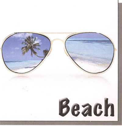
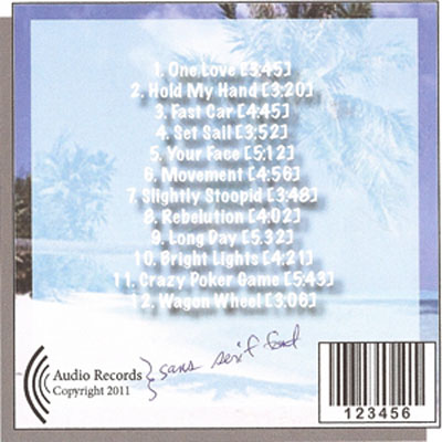
Sticking with the Charleston style, I chose a beach design for my CD. To emphasize white space I placed sunglasses dead center of the case on top of a white background. The sunglasses are a stark contrast to the bright white of the background and the reflection really add to the brightness. I chose a tropical picture to place in the lens of the glasses and a marker felt font to add the the casual style. I placed the same tropical image on the back and used the same font. However, I changed the color of the font to white so that it tied in the vast space of white on the front of the case. I chose a simple design of sound waves for the logo of the record company.
Advertisement
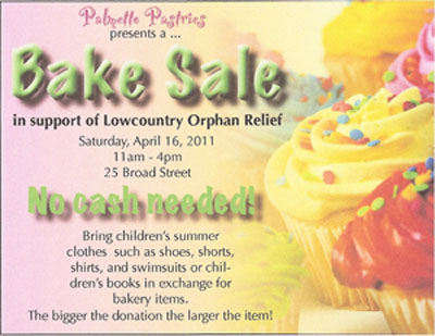
The advertisement is related to the company I made up for the business flyer. I chose bright cupcakes as the background, because I knew their bright colors and the simple fact that they are cupcakes would draw attention. I kept the font of the company name the same way it appeared on the business flyer so that it was recognizable. I again played with the black, simple font in order to create a vast contrast between the busy words and those I wanted to exaggerate. “Bake Sale” was made extremely big because thats what the advertisement is promoting. “No cash needed” was also enlarged because I figured that would be something that encourage people to come to the event.
Business Logo
I chose to create a logo for my own seafood restaurant because I have grown up in Charleston and seafood has always been a big part of my life. Blue crab has been especially important to me because my family spent numerous days out on the dock at Edisto crabbing. Thus the reason I chose a crab net as the picture on my logo. Summers is my middle name, so I chose that for part of the name. “Summer’s Catch” is also a play on my old memories. I chose solid black and a slightly fancy font to add the classy elegant style of downtown charleston. I hooked the two letter in the net to emphasize the overall idea of “Summer’s Catch.” The “s” and “c” are really exaggerated because they represent South Carolina.